Posted on August 23, 2016
Horses and Olympians and Data and Such
I pick on Aaron Carroll a lot, and it’s really not that he deserves picking on, it’s in fact because he writes so much good stuff that I like that I am compelled to investigate at length.  Fortunately this time he actually asked for comments, so here we are…
He recently posted a simple question (itself based upon a piece by Ben Rosen):  “Why are people getting so much faster, but not horses?” on The Incidental Economist blog, which you should read (the post, the site, all of it).
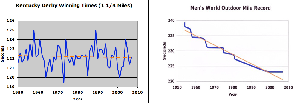
It has two pretty charts , and otherwise it’s very short.  But he asks for an answer to the question.  First, the charts… one depicting the wining Kentucky Derby time over 60ish years and the next depicting the world record human 1-Mile running record:

Charts from Ben Rosen
So, without the raw number or validating the trend lines, sure… the chart on the left shows a pretty even-keel trend (note the axis labels — the deviation is less than 5%, even though it looks spikey), while the one on the right shows a clearly, quickly, decreasing line.
Of course, the error is easy to spot, and I’m sure Aaron was being coy about it… you can’t compare best times at one race against a world record history. Â The right hand chart is NECESSARILY going to go down all the time. Â It would be astounding if the left hand chart did… if every single race beat the best time of the previous race. Â And remember, the right hand chart is the aggregation of hundreds, possibly thousands of races competing for that best race. Â It’s apples to oranges, and that explanation fits in a tweet:
@aaronecarroll I’m guessing breeding vs. training, but comparing a monotonically decreasing record to best times in one race is misleading.
— Chip Lynch (@chipmonkey75) August 22, 2016
Right, right, “monotonically decreasing” because world record times vs. one race is the core issue… “But wait!” I can hear you all gasp, in the back of your minds, why throw in the bit about training and breeding?
See, the reason this deserves more than a tweet, and thus the deep dive blog post, is that just because the charts used to ask a question were bad doesn’t mean the original question _itself_ was bad, and certainly we haven’t answered it. The answer to “why are humans improving faster than horses” is not “your charts don’t match”. Â It’s just the charts don’t prove the premise (that people ARE improving faster than horses), so we have to go back and look at it a bit first. Â (NB: I think they might be, thus the breeding vs. training comment, but we’ll come back to that).
To check the underlying assumption, we have to look at world-record times for horses. And that takes a bit of digging. The Guinness World Record people keep track of the “Fastest Race Horse“, but there’s no easily accessible history. Â And the horse-racing statistics site Equibase has a page of about 75 record times (combinations of different length horce races on dirt, turf, and all-weather tracks), but again these are only the current record holders.
But it’s a good starting point. Â The Kentucky Derby is a 1-1/4 mile dirt track. Â It turns out that the world record for a 1-1/4 mile horse run was NEVER set there (as far as I can tell)… the three records I can find are:
- Spectacular Bid ran 1:57.8 (117.8 seconds) on Feb. 3, 1980 at Santa Anita Park
- Noor ran it in 1:58.1 (118.1 seconds) on June 20, 1950Â “beating the prior record by 1.6 seconds” meaning…
- someone ran it in 1:59.8 (119.8 seconds)… sometime (Coaltown matched this in 1949, but the record had already been set)
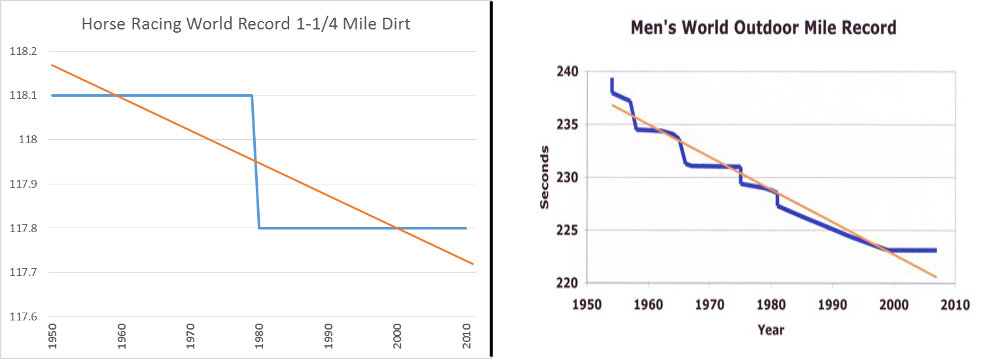
Ok, so that’s not much data and it was hard to find. Â I’m searching for a better set of world record horse racing data, but for now at least we can compare a chart in Excel because why not!
Hey look! Â Our trendlines nearly match! Â Horses HAVE been improving just like people have, right?! Â Excellent, case closed, let’s go home.
Except, of course, it’s not that easy either. Â These scales aren’t remotely similar (the left hand chart is eggregious, but both of them are misleading in order to fill in the space with an arbitrary y-axis) and of course the left hand side is based on exactly two points (note that the trendline is NOT the line between the two points… this is some of the oddity of evaluating a world record trend, since the data points for subsequent years are really imputed).
UPDATE – TWEET FROM AARON:
@chipmonkey75 Come on. That’s lying with charts. Horse times improved less than a second once in fifty years.
— Aaron E. Carroll (@aaronecarroll) August 23, 2016
But… but… right, but…Â the original chart… I mean… that was kind of my p…. oh, never mind.
Anyway, at this point, we’re going to need more data and to come up with a method of comparing the base premise… it’s easy to say that since a horse record was broken once in 50 years and a human record 10 times or so (I’m counting inflection points), that the idea that humans are improving faster is valid, it’s far from a rigorous statistical analysis. Â Is one incident at one distance, or one-second in 120 vs 15 from 240 THAT different? Â As mentioned before, there are dozens of horse race distances and categories, and the same goes for human records — is the mile an outlier? Â Do records get beaten as frequently and to the same degree in the 100-meter? Â In the half- and full-marathons?
I mean, it seems like it… from this limited data, I just think we should be more careful taking it for granted.  Still, I stand by my point that breeding plus classic training, which would have shown benefits a hundred plus years ago in horses, beats out modern training which has only recently become the massively streamlined situation it is today.  Sure people are physically changing too, and we may yet start engineering people for their speed, but for now, well…
let me see if I can dig up some data and maybe we’ll write a part 2…
Update update: I’m probably not going to get any more data, and since I think I wasn’t on the same page as the original post I’ll just bow out quietly without starting much more of a row, and point my reader (s?) to Stephen Few’s blog, where we can discuss visualizing data best practices (like zero-axis bases and similar scales) a bit better (and who, similar to Mr. Carroll, I pick on sometimes mostly because I like his writing and agree with him so much of the time).

